Our New Chiropractic Clinic Design! Office Reveal and Renovation Tips
It seems that home improvement has been THE quarantine project for many, and we at Alight Chiropractic are no different! We are unbelievably grateful to have the opportunity to help our patients and build our dream office, especially during this uncertain season. We hope to share more in the future and that our new journey will bring a sense of warmth and hope for good things to come in the next season for our community, near and far.
If you’re new here and unsure of who we are – Alight Chiropractic is a Gonstead Chiropractic office led by Dr. David G. Lee who is one of the primary (and few) Gonstead chiropractors in the Pacific Northwest. His practice is located in Kirkland, WA right on the cusp of Redmond, WA. His specialities include x-ray analysis, extremity work, and more. Read more about Dr. David on our website here.
Now, onto the big reveal.
Front Desk

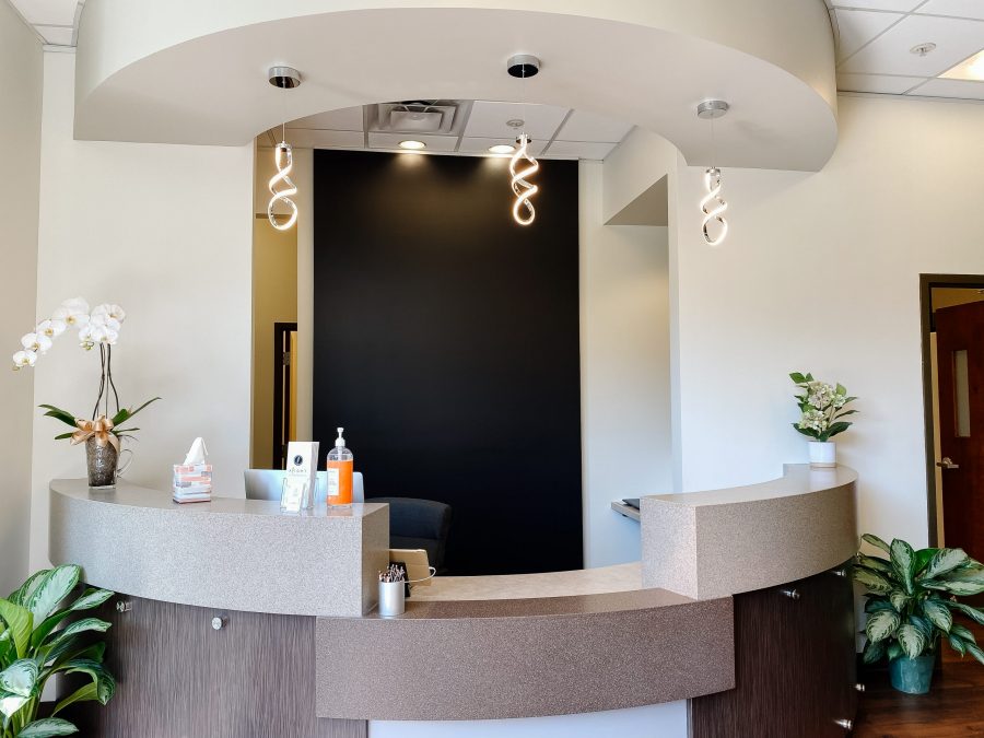
As our name suggests, Alight Chiropractic aims to put a smile on our patients’ faces with effective pain relief and wellness care! (Read more about our Mission here.) So, it’s only natural that we would design a bright and airy front desk area. We want those who walk in to be greeted by a smiling face and an open, inviting space.
The obstacle here was the formidable, concrete-looking counter coupled with the large, matching ceiling feature. They both charge a lot of visual space, reducing the openness of the entrance. Our solution? Painting the ceiling feature a light, neutral grey. This color offered enough substance to distinguish the area as an accent, but also feels light enough to open up the front desk.
Our Tip: Visit your local paint store and ask a paint color specialist to select specific shades for your color palette, which is exactly what we did to achieve this look. I showed them a picture, the wall paint color, and told them exactly what I needed to accomplish. We went over over 30 paint chips together before I finally settled on this color!
The Reception

First things first – more pictures to come! The reception area was actually the very last “room” we designed because of its significance as well as its odd shape. It is only a few feet from the front desk counter, meaning that we wouldn’t be able to have a coffee table or any other common features of a standard waiting room. We have one long wall across from an angled accent wall and that’s it. Well, we were able to still convey an open and inviting vibe with the wall paint as well as the furniture and decor.
Our Tip: Consider the lighting when choosing wall paint! Lots of natural light is key to bring out the true undertones in paint colors. Our reception is right next to our large, glass double doors, meaning there is plenty of natural light. We decided to go with an off-white rather than a pure white color to add some warmth and coziness. If a room has little to no natural light, consider choosing a cool tone paint to balance out the yellow in artificial lighting and avoid dark toned colors, which will visually shrink a room.
Chiropractic Adjustment Room

It’s a beauty, right? *wipes tear* This is Alight’s firstborn, Adjustment Room #2 (they are named by placement in the clinic). As mentioned before, we are one of the few Gonstead Chiropractic clinics in the Northwest, so naturally, Dr. David uses Gonstead-specific equipment. (Don’t know about Gonstead? Read more on our Gonstead page here.)
This presented a challenge of placement as Gonstead equipment consists of four different pieces: the Cervical Chair, Hy-lo Table, Pelvic Bench, and Knee-Chest table. Not only that – Adjustment Room #2 has a random metal pillar on one wall and a sink a few paces down! With several pieces to work with during patient treatment, we needed maneuverability first and foremost. We were able to problem-solve by placing the Hy-lo Table diagonally so that the patient could reach each piece of equipment with only a couple steps, in a triangle shape.
Our Tip: Consider your priorities and what you need your space to do for you. Flow and functionality are KEY in a good space design, especially in an office or medical setting. It also affects the visual integrity of the space because think about it – our brains also consider logic when looking at a room and if it’s set up in a confusing way, beautiful decor can’t always save it!
That’s it! 3 Renovation Tips to help you tackle your own reno project! We are so thrilled to share this space with our patients, and YOU. If you enjoyed our tips and have any questions about clinic or office design, leave us a comment below!
Otherwise, if you have any questions regarding chiropractic or health and wellness, please contact us at Alight Chiropractic today.


